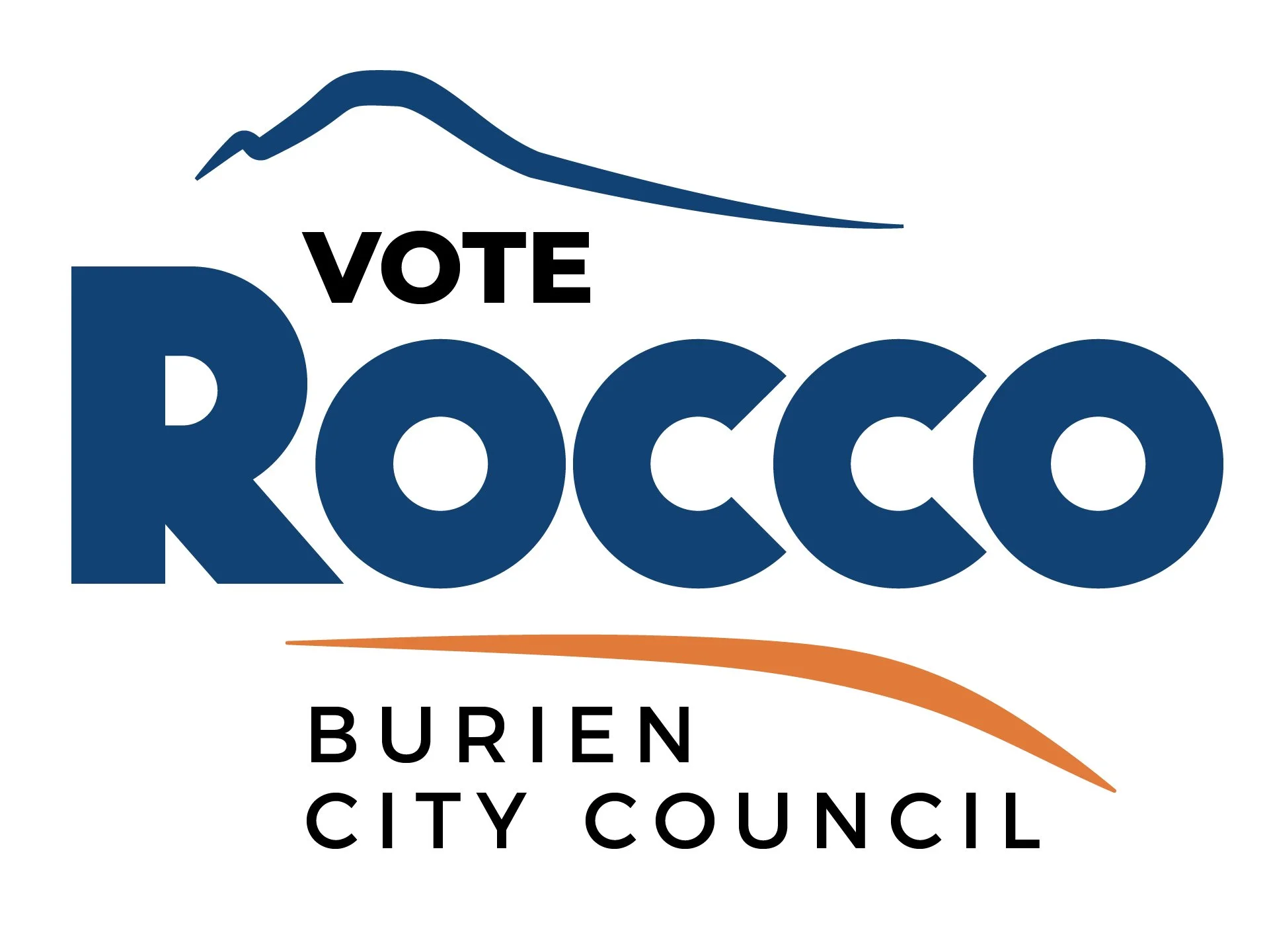
My partner throwing his hat into the ring for a seat on the Burien City Council in 2025 became a perfect opportunity for some design work that I had yet to ever consider: candidates need logos and photos too!
We both thought his first name is memorable enough on its own, so I tried some clean and friendly sans-serifs.
I had the idea to highlight the C’s in his name, as he is running for City Council.
The second one didn’t work well with how closed off the C’s are. They’re very hard to differentiate from the O’s at a distance.
Ultimately I landed on my first try, Mostra Nuova. There’s something about the more symmetrical O’s and C’s that I think work better when they’re tightly packed together like that.
Despite all of the curvy letters, there was still something flat about it, so I sized up the R to give it some extra visual impact. We ditched the dual colors to eliminate possible confusion.
I traced a low-resolution image of Mount Rainier, which is easily visible from Burien on clear days when “the mountain is out,” and added a small green hill.


